NYT Advertising Design System
Former Director of Ad Experience Design at The New York Times. My team was tasked with ensuring the ad experience was integrated with the core product experience across the site. That included 1) maintaining the editorial integrity of the Times. There should be a clear distinction between editorial and advertising content. And 2) the content nor functioning of the advertisements should detract from the quality of our journalism or our users’ experience. Creating a consistent, intuitive and human-centered design system was key to achieving these.
the new york times / vp, ad innovation: allison murphy / director of ad experience design: christy sabido
Flex Frames
It began with the creation of the Flex Frame. We asked: How can we offer our advertisers a more premium ad format while improving the overall user experience of the site? The Flex Frame is a proprietary ad format, with a larger canvas vertically as well as horizontally as it is full-bleed and responsive across platforms from desktop to mobile. It is in-stream within an article providing advertisers more adjacency with editorial. It is also component-based requiring the advertiser to simply provide assets such as image, text, and logo to create the unit.
We launched over 18 products within the first 2 years. It consistently performed well with twice the click-through rate compared to standard IAB units. Here are a few examples of the units.
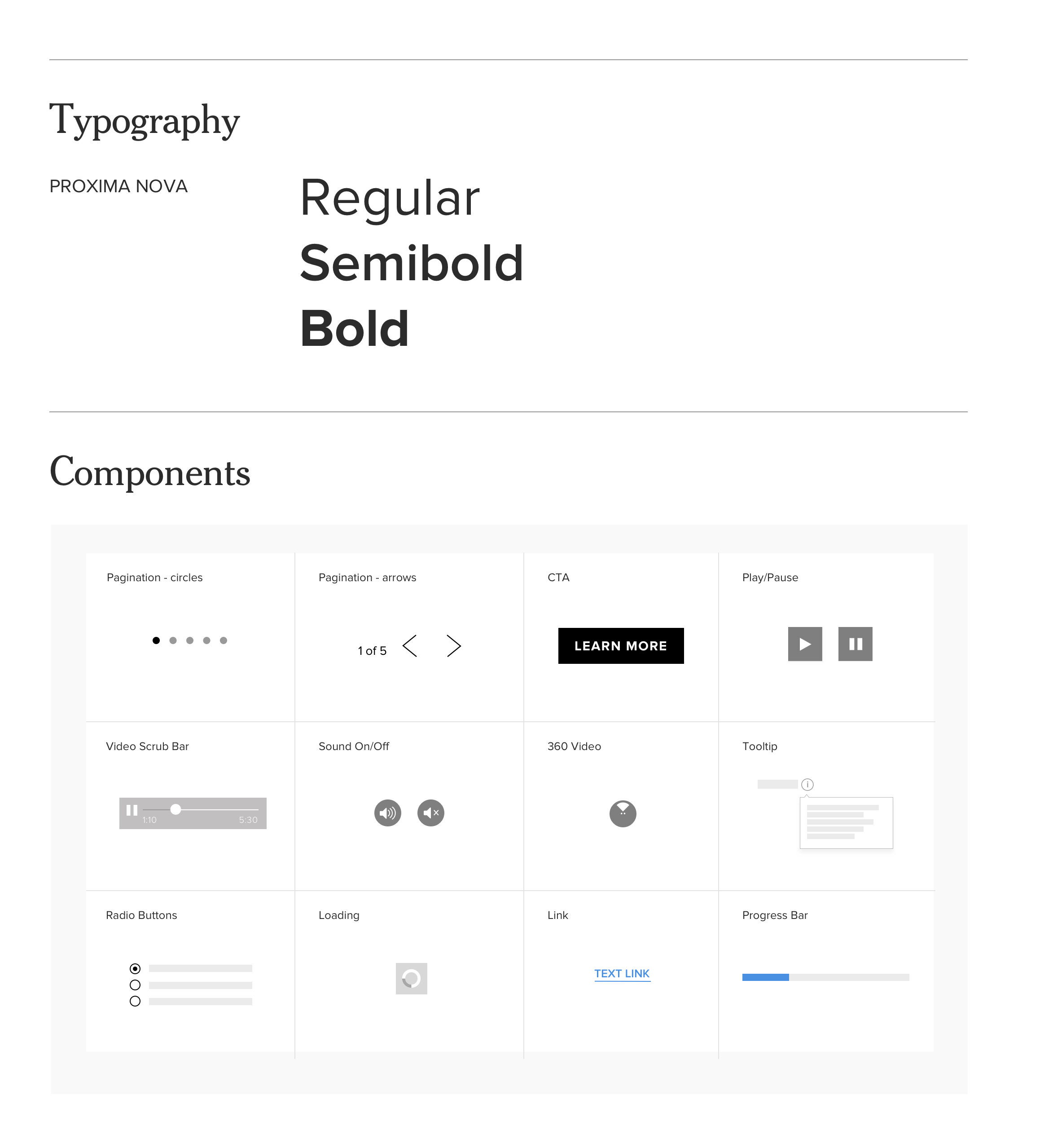
We created a visual system to allow this new format to be repeatable and scalable for varying advertiser content. These components were eventually applied to visual cues across the site for a more holistic advertising experience outside of flex frames.
In 2018, the new Story page launched to provide an integrated reader and advertising experience, designed around flex frames. We moved away from the standard page format of most news organizations having the article on the left and a rail on the right filled with related content and advertising. The new article page was presented in a single-column layout to allow users to focus on the main content—our journalism. This allowed for a premium advertising experience with the flex frame being full bleed, in-stream and responsive to the page’s width.


